
Stop Interrupting Users: Smarter Ways to Promote New Features
Lessons from Apple Fitness and Slack and the two very different approaches they've taken to promoting new features

Have you ever been stopped dead in your tracks by an interstitial promoting a feature of the app you’re using? You’ve been a victim of adoption metric growth hacking. In other words, a lonely growth PM has aggressive goals to hit, user experience be damned.
In this edition of Shipping on Fridays I’m going to critique two different approaches to promoting a feature using Slack and Apple Fitness as case studies.
Interrupting the User: Apple Fitness
Recently when opening Apple Fitness I was hit with this interstitial promoting new features. This is not an uncommon pattern. An app is updated, presumably with features that solve real customer problems and the team announces the new features.
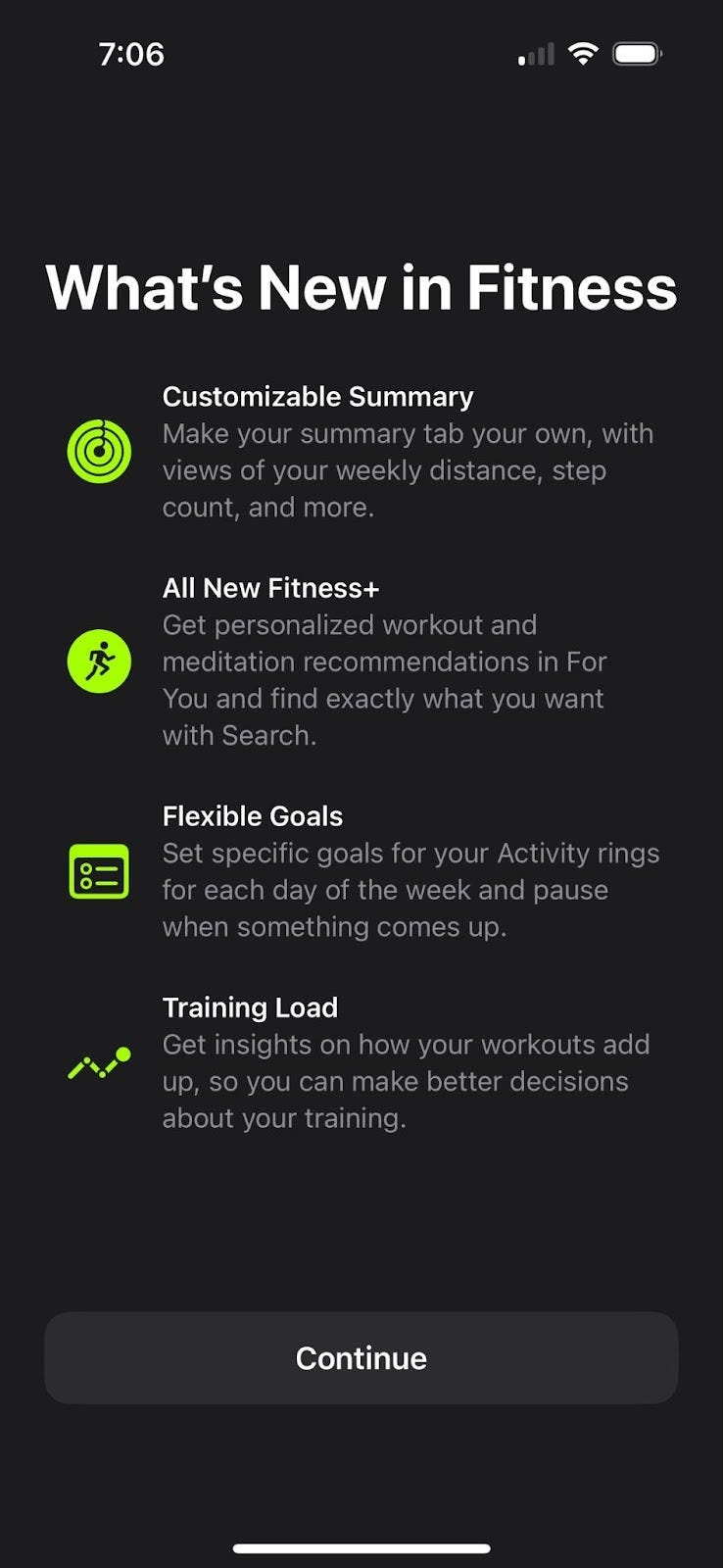
The interstitial appears once for anyone opening Apple Fitness after an update—likely targeting all users regardless of relevance. I tested it myself: after closing and reopening the app, it was gone. The team behind it was probably aiming to boost daily active users of the new features, or tracking the percentage of users who see the interstitial and engage with the feature afterward.
Let’s take one of the features, “Flexible Goals” as an example. Presumably Apple got customer feedback that fitness users wanted their goals to be dynamic and adjustable to changing circumstances. That feedback probably came in qualitative form (app reviews) and quantitative (perhaps they saw a sizeable population of people adjusting their goals up and down with frequency).
Despite the feature being built for a targeted user segment, it is promoted broadly, interrupting everyone’s journey. Ooof! It’s also out of context. Imagine there was a contextual prompt that displayed inline with my goals?
In-context: Slack
In contrast, Slack uses a discreet contextual promotion to let me know about a new feature. In this journey, I was already on the DM tab of the app and had pressed the “plus” icon. This modal popped with options of actions I could take, with the largest CTA to draft a message.
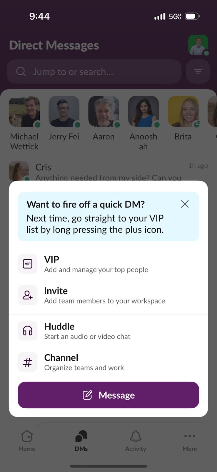
In this case, the new feature, a shortcut to DM, is directly relevant to the action I’ve just taken (hitting the “plus” button). I’m in the target audience for this message. I’m on the DM tab, I’m about to DM a colleague and Slack is trying to be helpful and show me a faster way to accomplish my job.
The UX of the contextual prompt is also well thought out. The prompt itself doesn’t try to disguise itself as part of the content, it’s shaded and is a clear promotion. It also respects me as a user - it doesn’t interrupt my journey (you could imagine an alternate reality where Slack blocked my ability to DM until I acknowledged their new feature - like in Apple Fitness).
Conclusion:
Next time you're launching a new feature or trying to hit those tough growth OKRs, keep a few things in mind:
Who did you build it for? Be specific. A great feature promoted to the wrong audience is a miss.
Where and when will they care? Consider the user's context. Are they in the right mindset to learn something new? To try something new?
Does the prompt guide or block? Helpful nudges win. Roadblocks rarely do.
How might success metrics shape the experience? If you're optimizing for short-term adoption, are you sacrificing long-term trust?