
Faster Food, Smoother Onboarding: A Deep Dive into Uber Eats’ First-Time Experience
The first impression matters. Let’s break down what’s working—and what could be better—with Uber Eats’ onboarding flow.

Competitive analysis can be a fun task. Recently at work I started re-focusing on the first time user experience. What better way to jump in than examine a popular app? Surely they must have tested their onboarding dozens of times and created a perfectly optimized experience, right? (⚠️Spoiler alert! Perhaps they aren’t optimized!)
I chose Uber Eats, an app I use nearly every Friday and started fresh. Here’s a tear down of the experience and some “if I had a magic wand, I’d change” thoughts:
Login & Initial Sign-Up: Too Much Security Too Soon?
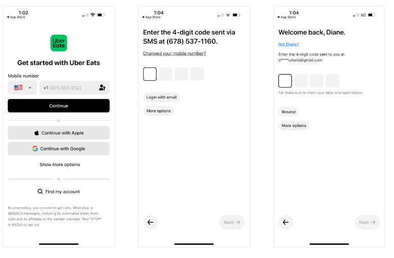
After re-downloading the app, I began the sign-up process by entering my phone number. I patiently completed the 2 factor authentication and then, to my utter shock, I had to do it again!
The app presented me with two separate verification steps, including one screen that asked if I had changed my number. I wondered if this was because I was using my mom’s phone number and Uber smartly recognized the number as associated with someone else’s account?
Regardless, the security felt excessive—especially for a food delivery app. I immediately wondered: is this extra friction really necessary at this stage?
🪄Magic Wand Optimization:
Imagine if I could browse restaurants and stores to order from without being logged in? My hunch is that the majority of brand new downloads are from people that are hungry, or need something from a store immediately. Why not let them browse, add food to their cart and get them to checkout before requiring an account?
Bolder option: allow guest checkout!
Location & Push Notifications: Is Uber Asking at the Right Time?
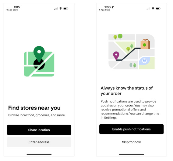
Once I completed verification, the app prompted me to share my location. I thought, “ok” this is a sensible pre-requisite. In order to show me legitimate restaurant and store options Uber needs to know my location. I accepted.
The immediate next screen asked me to allow push notifications. As a customer I wondered why I need push notifications at this stage of my journey? As a Growth PM I have an inkling that this is so they can send me a notification if I abandon my cart. As a hungry guy looking to get lunch, however, I thought “just show me the food already!”.
🪄Magic Wand Optimization:
Delay the push notification request until after the first order is placed.
Hypothesis: Users who are actively tracking their food will be more willing to enable notifications, leading to higher opt-in rates without increasing drop-off during onboarding.
Uber One Membership: Growth Hack or a Trust Killer?
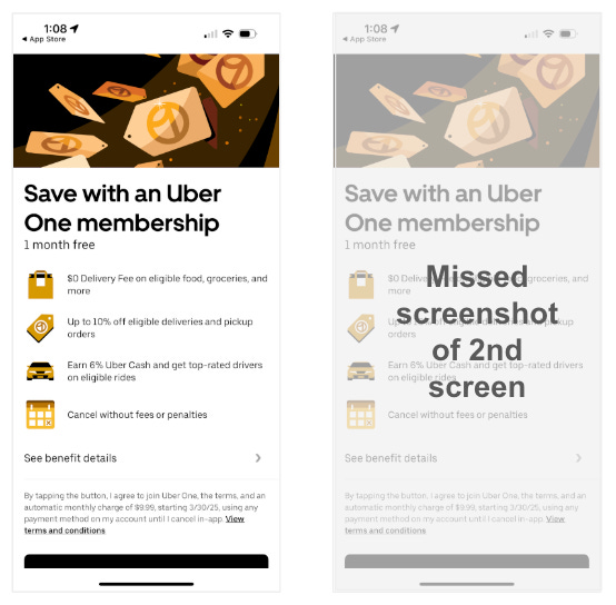
Next up was their subscription play. I was shown the Uber One membership option screen. I get this, membership at this point might be enticing for a first time customer - the savings are real. From Uber’s perspective it is probably one of the highest conversion placements. A few aspects of the screen itself surprised me, however:
CTA below the fold (where do I click?!) How do I sign up or skip?!
While Uber One offers 1 month free, this was not prominently displayed. In fact it was almost downplayed, like someone whispering “pssst, ‘1 month free’”.
The copy also seems sterile. For example: “See benefit details”. This CTA almost seems written to deter clicks. It sounds like it’s going to take me to a screen of legalese. If there are truly more benefits or details that would be beneficial to know, perhaps “Details about everything you get” or even just “See all Membership benefits” would be more enticing. And if it actually is just legalese, why not move it below the primary sign-up CTA?
I clicked “skip” ready to get into the product.
At first I thought that “skip” hadn’t worked because the very next screen was another Uber One Membership screen. My second thought was that I had done something wrong and perhaps had clicked “subscribe” by accident. Then I thought perhaps I’ve landed on an enrollment screen for a new program. Too many thoughts!! By now I’m thoroughly confused and forgot to get a screenshot (sorry!).
I read the subheader on the new screen “As a welcome to Uber Eats try out our Uber One membership free for 1 week”. Wait, this is the thing I just said “no thank you” to, right? Or is Uber trying to tell me that even though I clearly said “no” to the free trial, they enrolled me anyway? 🤔
The only CTA is “got it” so I have to accept the offer / non offer and in a confused, frustrated state I proceed.
🪄Magic Wand Optimization:
Don't deceive your customers. There’s no faster way to kill trust than to trick people into programs. And when trust dies, retention falls and other metrics that Uber Eats cares about also decline (like orders!).
The last emotion you want a customer to feel after onboarding is confusion and frustration. A good onboarding flow should leave a customer feeling excited to get going with your app. The feeling you should go for is that childhood euphoria of unwrapping a long desired present on your birthday.
First-Time Home Screen: A Missed Opportunity?
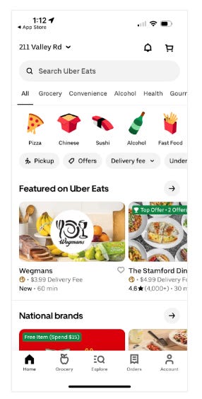
After completing onboarding, I landed on the home screen, which looked identical to the standard Uber Eats experience. There was no introduction, no walkthrough, and no personalized suggestions—just categories of food and restaurant options. Having used Uber Eats before, the only noticeable difference was the absence of an “Order Again” section.
🪄Magic Wand Optimization:
Imagine how this might be different if Uber Eats asked a few questions (either in onboarding or on this screen) to better understand the goal of the user. For instance, perhaps I downloaded Uber Eats because I am hungry for lunch and want to treat myself. A few questions with multiple choice quick replies to get at a customer’s reason for using Uber Eats and their preferences could go a long way. Knowing this information could allow Uber Eats to present a few highly tailored options on the home screen rather than metaphorically dropping the customer off at the front door of a shopping mall and letting them wander in.
Final Thoughts: Actionable Lessons to Improve Onboarding
Uber Eats’ onboarding experience is functional but leaves room for improvement. The current flow appears designed primarily around business priorities—securing user permissions, enabling marketing channels, and driving Uber One subscriptions. While these elements are important, they risk overshadowing the user’s needs and expectations.
Uber has an opportunity to transform onboarding into a seamless, user-first experience—one that not only facilitates transactions but also personalizes the journey. By better understanding customer goals, preferences, and intent, Uber Eats could act as more than just a delivery service; it could become a true food concierge, guiding users effortlessly from app download to a great meal.
A seamless onboarding experience should feel intuitive, build trust, and guide users toward their first successful action. Here’s how Uber Eats—and any product team—can improve onboarding for new users:
Reduce friction at login. Limit security barriers to what's essential. If a phone number is flagged as previously used, provide clear messaging rather than redundant authentication steps.
Ask for permissions at the right time. Location makes sense upfront, but push notifications would be better received after a first order—when users are actively tracking their food.
Respect user intent. If a user declines an Uber One trial, don’t reintroduce the same offer in a way that creates confusion. Clarity builds trust, and trust builds long-term retention.
Guide users toward action. Instead of a generic home screen, use onboarding to personalize the experience. Ask users why they’re here—whether for a quick meal, groceries, or a group order—and tailor recommendations accordingly.
What do you think? Have you seen similar onboarding friction points in other apps?
I frequently leave a site for many of the reasons you bring up. If I’m hungry and want food quickly, just get to it. The double security and asking if you want to sign up for additional options that impede your intent of fast food now is a turn off. Agree wholeheartedly that some sites seem more focused on upselling than satisfying the original purpose people come to the site.